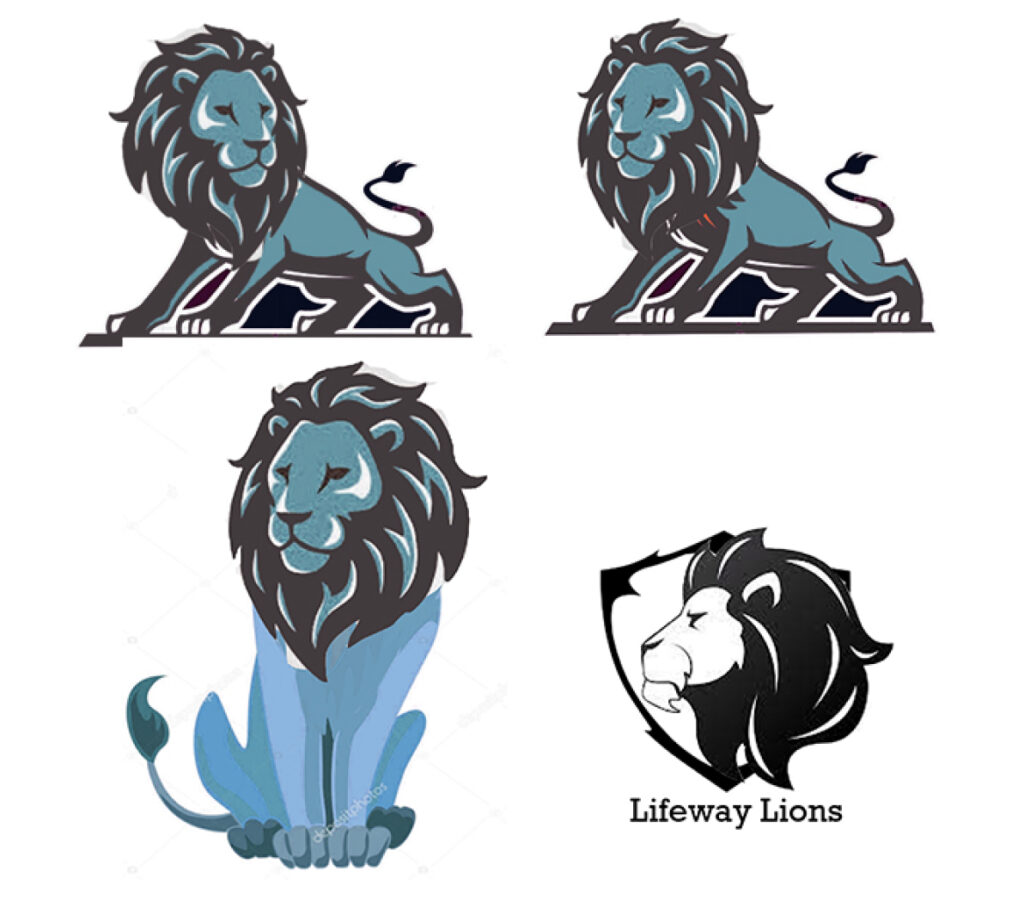
Case study:

Lifeway Baptist School

Role: UX Designer & Front-end Developer | Tools: Sketch, Ai, WordPress

Case study:

Lifeway Baptist School

Role: UX Designer & Front-end Developer | Tools: Sketch, Ai, WordPress

Problem:

Lifeways’ outdated website requires a much-needed refresh to establish its school program as a prominent and credible force in Cuero. The key stakeholders seek to improve user experience, enabling easy registration for parents, thus gaining a competitive edge over rivals.

Overview:

TXCAPstudio was thrilled when Lifeway approached us with their vision of creating a better and fresher look for their school site in order to increase recruits and demonstrate Lifeway as a credible educational institution for in Cuero, Texas.

Goals:

TXCAP started by conducting in-depth discussions with Lifeway’s team to gain a clearer understanding of their goals, values, and target audience. This helped us align our design strategy with their vision and objectives ultimately deciding on:

1. Branding Establishment

The initial objective was to establish Lifeway as a recognized school. Most educational institutions have a mascot and a slogan. After several discussions and drafts, a unanimous decision was reached to adopt a lion as their brand symbol.

The goal was to capture a sense of fierceness while maintaining a child-friendly nature to it, representing the early-childhood development aspect of the school. Below is the logo I created for Lifeway.

Inspiration mocks
Final Headshot
Final Body

2. Organize & Research

I then conducted competitive audits to understand the market in Cuero, Texas, and identify the unique selling points of Lifeway. This allowed us to position Lifeway’s brand effectively and highlight its distinctive features.

After auditing, we optimized the website’s content architecture to ensure that the information about Lifeway’s curriculum, faculty, facilities, and extracurricular activities was easily accessible. A well-organized site not only enhances the aesthetic appeal but also improves the overall usability. When prospective parents and students visit the website

Old LBS Site

3. Re-Design

To achieve a better and fresher look, we revamped Lifeway’s website design with a modern and clean aesthetic. We used a combination of vibrant colors, high-quality imagery, and engaging typography to create an impactful visual experience that would attract attention and leave a positive impression.

Old LBS Site

New LBS Site

Optimization & Responsiveness:

Recognizing the importance of mobile devices in today’s digital landscape, we ensured that Lifeway’s website was fully responsive and provided a seamless browsing experience across different screen sizes and devices. By optimizing relevant keywords, meta tags, and page descriptions, we aimed to increase organic traffic and enhance Lifeway’s online presence. 

Search results ranking LBS #1 hit

Analytics and Monitoring:

After launching the new website June 10th TXCAP’s analytics tools to monitor user engagement and traffic patterns showed traffic increased 50%. This data helped Lifeway track the effectiveness of the site and make informed decisions for continuous improvement.

Metrics showing a +50% increase

Results:

By collaborating closely with Lifeway throughout the design process, we successfully created:

  • A visually appealing and user-friendly website that communicated Lifeway’s strengths.
  • Implemented SEO best practices to improve website visibility in search engine results.
  • Showcased its unique, forms, and program offerings a dynamic well-organized way
  • Increased site traffic by 50%
  • Instilled confidence in parents considering a christan school in Cuero, Texas

My Keys Takeaways:

This was my very first project when I started at  TXCAPstudio, and it holds a special place in my heart. I was entrusted with the task of creating a logo for Lifeway, and it was such an exciting opportunity for me to witness the entire design process unfold from start to finish. This project became a tremendous learning experience for me on multiple fronts.

I had the chance to improve my client communication skills significantly as I took charge of managing interactions while working on the new website and reaching out for content. It was both challenging and rewarding to be the bridge between the team and the client.

Throughout the journey, I discovered the power of iteration. Although I didn’t directly test the final product, I received valuable feedback on each version we rolled out. This taught me the importance of continuously improving and refining a design until it reaches its full potential.

The project felt like a full-circle moment. It offered me so much insight into redesign, enhancing user experiences, and addressing real challenges faced by our clients. I’m incredibly grateful for this experience, as it has shaped me both personally and professionally. It showed me the true essence of a fulfilling design journey